Let the kids paint your face
VIEW
The Evolution of Branding: Staying Current in a Dynamic World
VIEW
Brand Extensions: Unleashing the Power Beyond Your Logo and Website
VIEW
Quit the Socials
VIEW


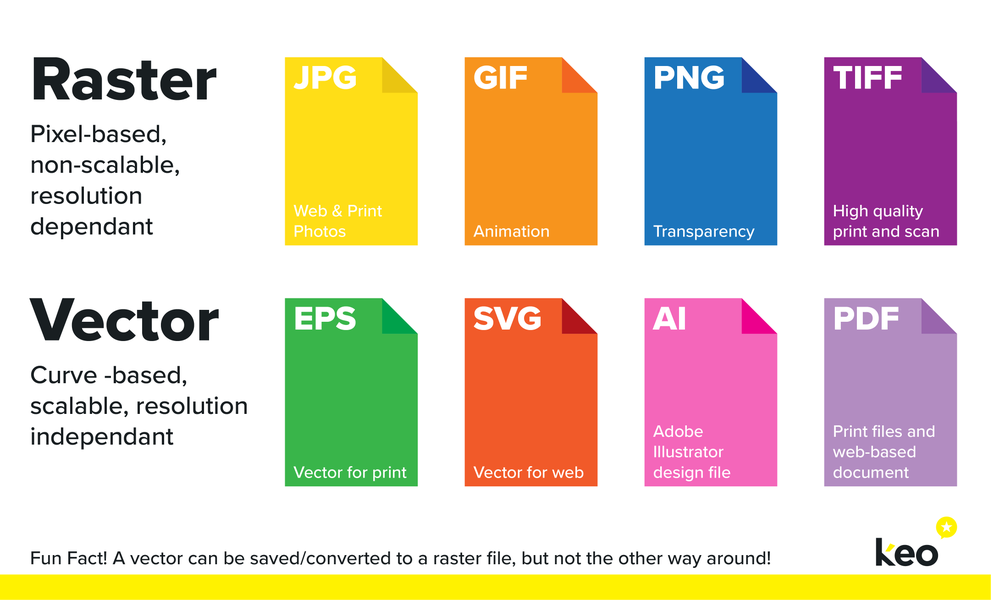
Towards the end of a branding project with KEO, you get a logo package containing all your logo variations, file types and a handy guide on which file to use for different applications. But what does it look like if you use the wrong file?
No doubt you've seen an image, whether it be printed or on a website, that is super pixelated, maybe even sitting in a white box that seems out of place. This is a common example of using the wrong file type, at the wrong resolution. The reason it's a common mistake is that with around 10 file types, and a number of factors that affect each one, it's easy to get them mixed up and use the wrong image.
Raster graphics, composed of a set amount of pixels arranged to display an image, cannot be scaled up from their original size without enlarging pixels and lowering the quality of the image. You wouldn't have much success trying to enlarge a 50x50 pixel image to fit on a billboard!
Whereas vector graphics are made up of paths, each with a mathematical formula (vector) that tells the path how it's shaped. In simple terms, this means you can make the image as big as you want, and it will stay crisp and clear.
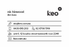
How is a potential client meant to trust you with their business, if you can't ensure quality control of something as basic as a clear and legible logo on your website? Would you trust us if we handed you a business card that looked like this?
It's important to ensure your businesses image is schmick, from the tiniest piece of copy to the biggest billboard on the highway (Think back to our blog 'You have a stain on your shirt'), this consistency in quality shows potential and existing customers that you care; not just about them, but your business too.
Hopefully, this article has helped you understand the different file types and which ones are best for your project! Still unsure?


VIEW
VIEW
VIEW
VIEW